ShopDreamUp AI ArtDreamUp


Suggested Deviants


Suggested Collections


You Might Like…


Featured in Groups


Comments41
Join the community to add your comment. Already a deviant? Log In
Originally, I was going to comment, but I figured a critique wouldn't be bad --u --.
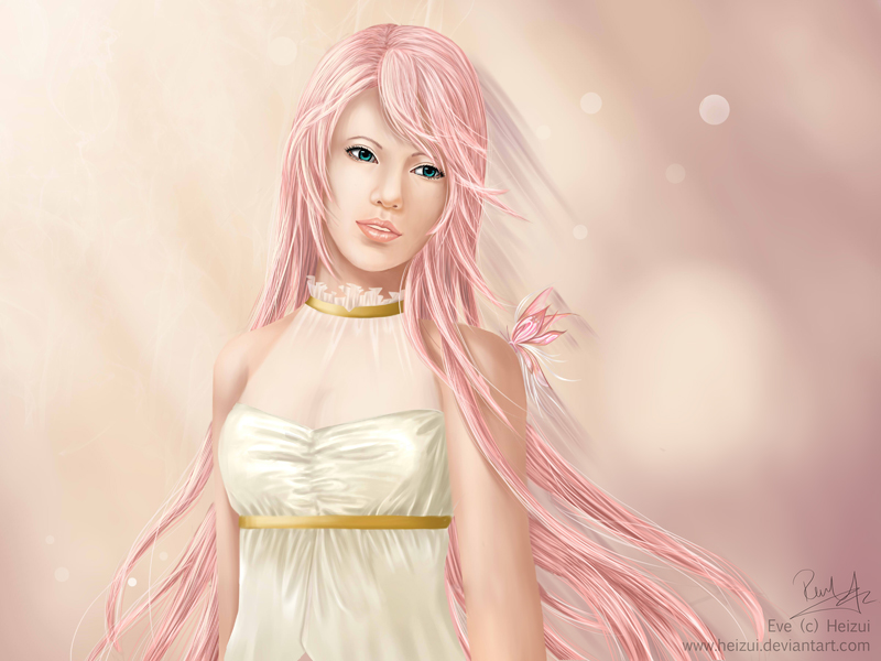
First, I love the almost monochrome feel this has (other than her eyes and her waist). It gives the picture a sense of fitting together.
Second, I like how you executed the light source. I can clearly tell it's from the side, because of how you painted the right side darker than the left, and the shine of Eve's skin and dress also confirms that.
Third, I think you did very well with the individualism of the hair; the strands are very nicely seen. I suggest you be careful with the direction of the strands though; (I've done this too out of carelessness)if not, her hair may seem a bit matted. The buttefly also looks nice with the hair.
Fourth, I agree with the other critiquer about the neck. Seeing the other picture of Eve, I'm guessing she has a neck slightly on the wider side.
Generally, a human face is rounder, but right now, since you have a longer face in semi-realism. If Eve had a round face, then the neck would look fine (though you'd have to change the body, most likely), but since she's thinner faced in here, I suggest thinning the neck a little too, just to fit with the picture.
I also find the pink color of the background similar to the skin color. I'm not sure about others, but to me, she camouflages a little.
Now, the neck and the background don't bother me as much as one other thing: the face.
I feel as if the upper bridge of her nose is a bit too thick. The part between the nose and mouth, I think you emphasized it a bit too much. We're not super up close to Eve, so it shouldn't stand out as much. I suggest using lighter shades of skin color instead of white.
All in all, you're doing quite well in digital, despite some parts that could be slightly improved. <img src="e.deviantart.net/emoticons/s/s…" width="15" height="15" alt="